The colour Blue is such a versatile choice in the paint palette and commonly used in the home, office, commercial and public spaces. It is a colour which sets a tranquil tone for work, study and rest, making it an extremely appealing choice for areas such as bedrooms, home offices, bathrooms and even kitchens. Blue is a colour which has many positive associations within society such first place being blue ribbons and the best stocks being blue chips. This elite connotation makes it a regal colour and a very popular choice when it comes to adorning our properties.
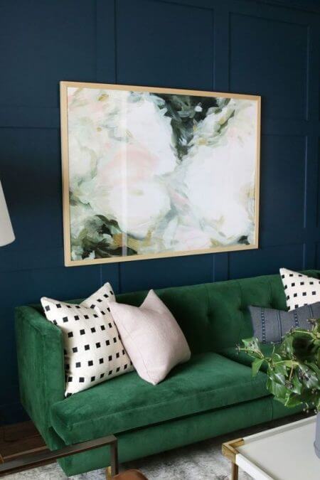
 A complementing colour to blue is white and orange. To create an appealing space think of pairing white or orange to create a striking finish. Consider reddish-orange furniture such as maple or mahogany with blue walls. This is even evident in nature where many blue flowers have white or yellow centres. Green is also a surprisingly complementary colour to blue also. Stick a green couch in front of a blue wall and watch your space be transformed. Similar to in nature where the blue flowers are surrounded by green leaves it sets the scene for a very impressive space.
 Blue is very often associated with the beach. To recreate the feelings and colours of the water and the sky in your property it is important to consider the light within the rooms which you are wanting to paint. For spaces which are lit up by morning or afternoon light then go with more clear blues. For spaces which are artificially lit with the use of bright lights then different shades of blue are required.
Relaxation spaces such as wellness rooms, spas, bathrooms and bedrooms benefit from warm sea tone blues. If the space has a lighter colour flooring then lighter hues of blues will provide a subtle but very soothing setting for a restful space. To create a level of depth or complexity to walls then multiple layers of colour are required by using different painting techniques. Such effects will really suit spaces with simple furnishings. To create a mood similar to the ocean in the late afternoon use softer grey-blues which creates a very tranquil mood which is appropriate for spaces such as meditation areas, offices or quiet sitting rooms.
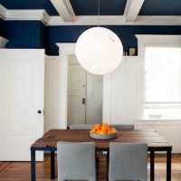
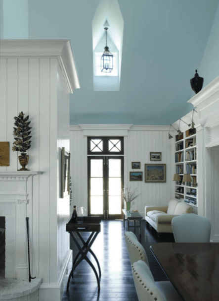 Ceilings are usually a surface which is always painted white with no consideration to any other colour. However, painting a ceiling blue can create so many different moods and emotions. Blue hues on a ceiling suggest a similar feeling to a clear daytime sky. Even using such techniques of rag-rolling white onto a blue ceiling in a nursery recreates the feeling of floating puffy clouds which, when gazing upward becomes very effective. In contrast the feeling of the night sky would lead to dark, deep blues such as navy or midnight. This creates a dramatic yet luxurious feeling. Dark colours on ceilings can make the ceilings seem lower, however it is a great remedy for high or vaulted ceilings. White is a colour which relates to cleanliness and good hygiene however, the over-use of the colour in an already bright space creates glare and can make a space feel very sterile; Blue is a great alternative for this scenario. To view a wide selection of Blues click here.
